
The problems
I moved to the pricing team in Booking.com in March 2021 and asked to tackle some key problems such as:
- Lack of consistency in how pricing, benefits and deals (merchandising elements) were being shown across the product for customers
- No clear guidelines of how product teams should display their merchandising elements and more and more teams wanting to display their features
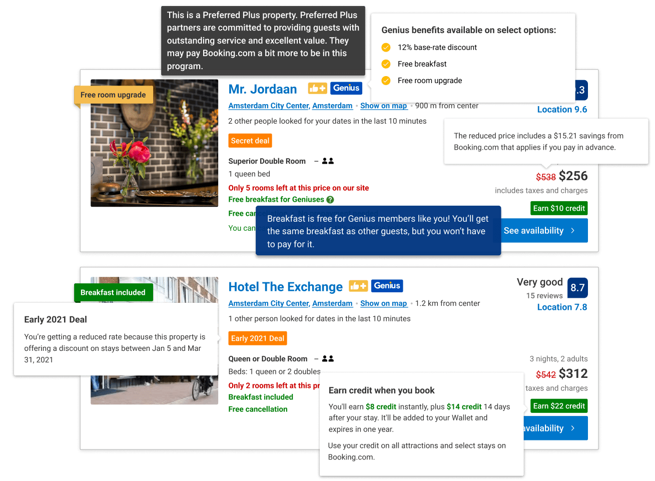
- Teams were fighting for attention for their product which resulted in a cluttered UI for customers which led them not understanding important information such as what benefits they receive from the loyalty program Genius
The goal
- Define a flexible platform establishing hierarchy between different value offerings
- Envision how to communicate value in concert with the new design language
- Document key concepts and reasoning behind the use of pricing UX patterns
My role
I was the lead designer on a team in the pricing department at Booking.com since March 2021.
The design manager & director in my department challenged me to look at how we could create a vision for how we communicate value to customers through our merchandising elements and empower teams to experiment quicker and more scalably.
Gathering insights
We began the project by using a mixture of techniques such as:
- Interviewing product teams to gather their pain points and needs
- Reading through previous research around merchandising
- Competitor research to see what patterns typically used with merchandising
Key insights
Customer didn't trust that they were being presented with real deals a lot of the time. They felt that price had been manipulated to show a discount and didn't pay much attention to deal names.
Product teams are in a lot of cases not aware of existing components for merchandising elements and are building them from scratch which is slowing down design and development time
Exploration phase
Audit the current experience
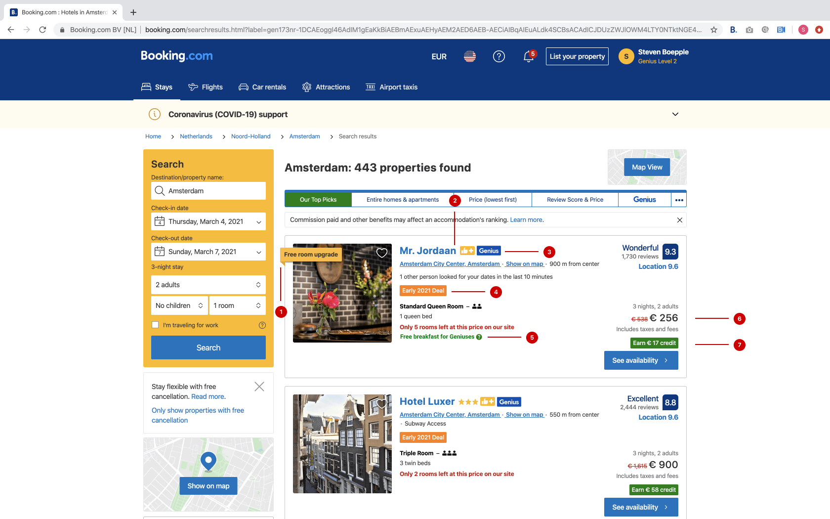
We kicked off by reviewing the experience across all platforms and making a list of the merchandising elements that exist on the product.
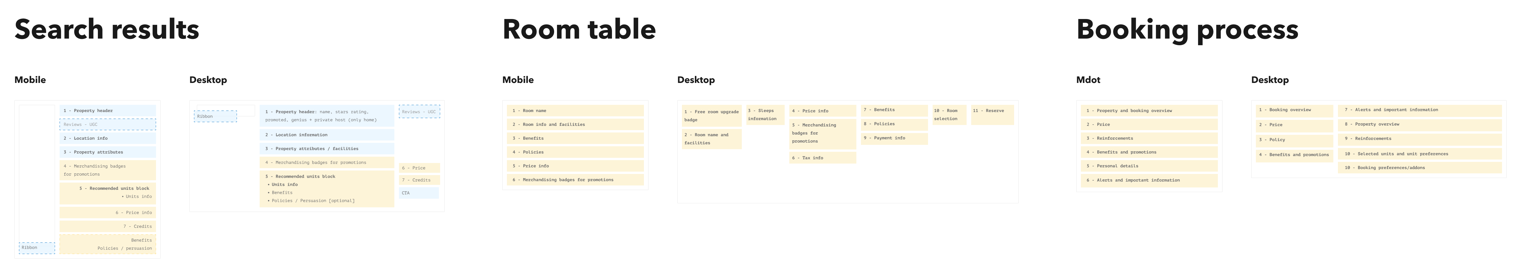
Information architecture
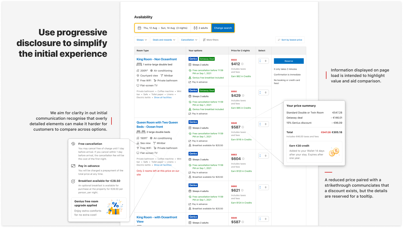
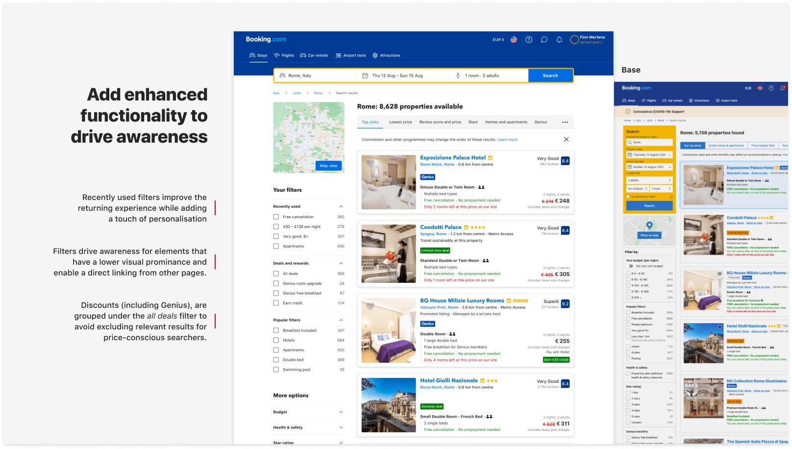
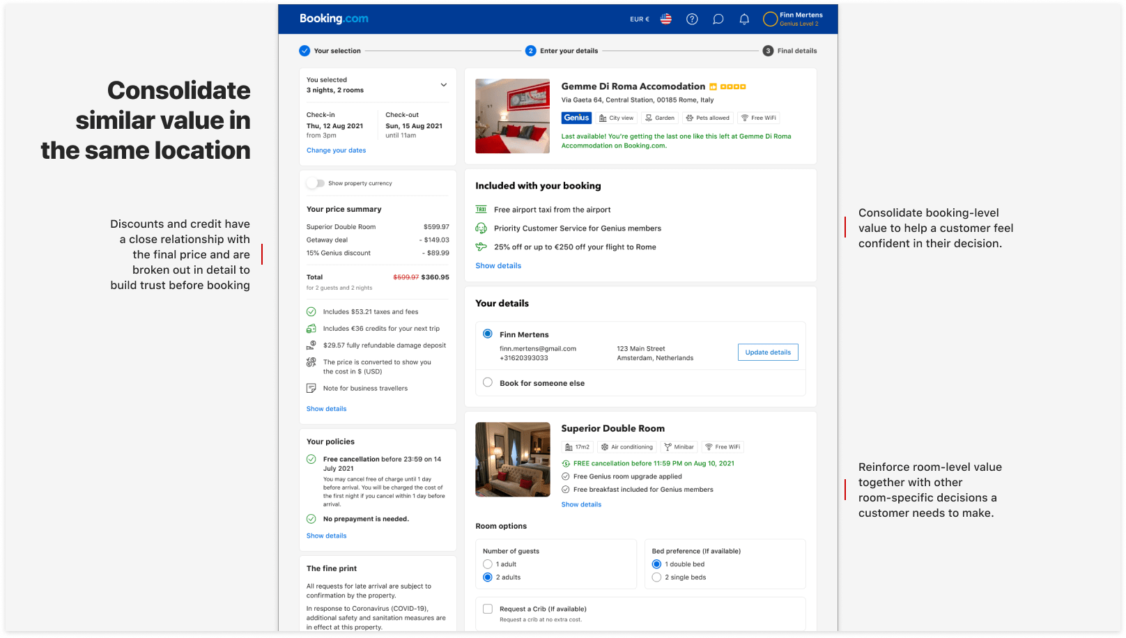
A big problem that we have is how benefits are displayed in different places and styles across the funnel and there’s no consistent placement for them. I collaborated with the teams from search results, room table and booking process and suggested a new approach where we could dedicate spaces on each page for merchandising element.
Design explorations
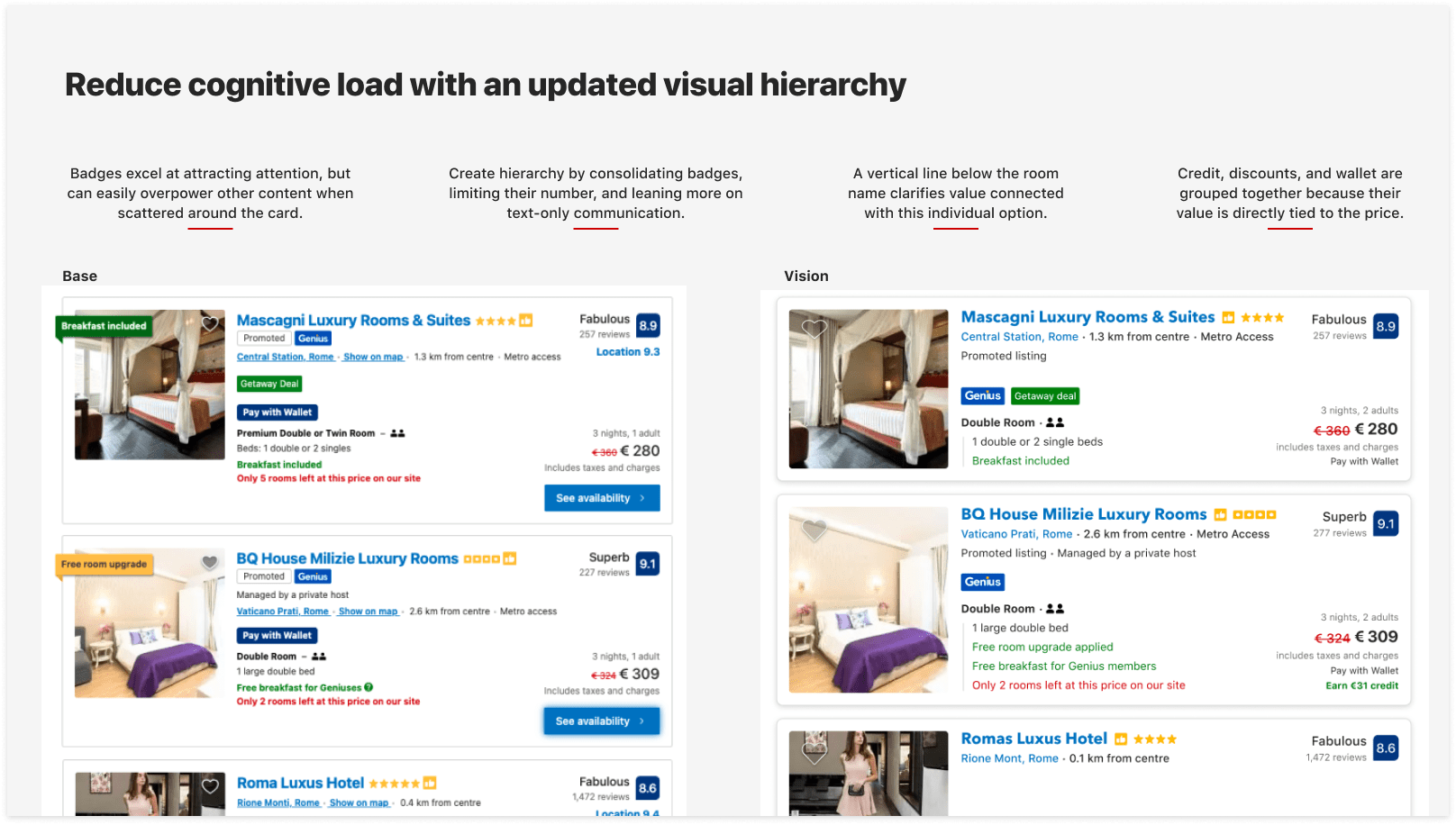
From there I could explore design approaches for how those elements could look and how they would scale for new products that get added down the line.
Testing our designs
I worked with my researcher and set up usability tests to go through our designs for both desktop and mobile in order to get quantitative feedback and refine our designs before moving forward with A/B experimentation.
We tested with 10 users in total and some of the key learnings were:
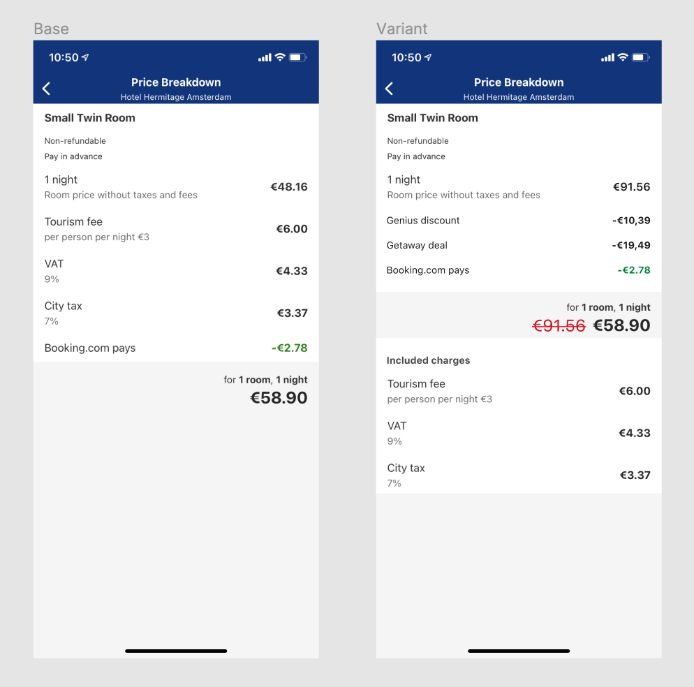
- Over half of the users wanted to know more about what contributed to the discount in order to verify that it’s a real one and not made up
- Users didn’t spot the benefits information on the booking page and were more focused on the final price and room details than additional value
Preparing for experimentation
We got positive feedback in the usability test about using a discount price breakdown instead of one that breaks down taxes and charges so we set up experiments for this for all platforms. We prepared this experiment for iOS to test that change.
Reflection on the project
It’s not too often that you get to work on such a large project in the company due to the amount of teams there so it felt very challenging and fun to work on this. I left the company in September 2022 and there is still a lot of experimenting still to do with this. Some of the things I learnt from it are:
- Don’t make the ‘vision’ the ultimate goal of the project. I got fixed on making a perfect vision early on but realised later that it’s better to focus on creating patterns and principles which will always adapt to new changes to the product
- Trying to focus on goals within this project for both product teams and customers at the same time was a challenge. Looking back I would like to focus on solving customer problems first and then focusing on the product team.