
About the project
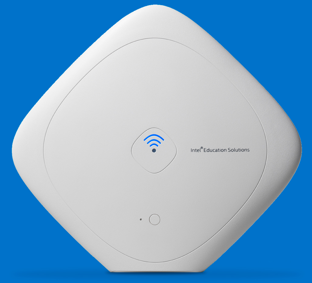
The Content Access Point is a device that stores, manages, and publishes digital content for schools with low/no connectivity. As part of the Word Ahead Curricula & Alliance team in Intel I worked as the lead UI designer for the software which is shipped on the device to allow teacher to manage their content and create lessons for students.
Our team was based in Ireland and worked in collaboration with the China team who focused on the hardware along with key stakeholders in America overseeing the project.
My role
In February 2014 I was brought on board to work on the UI design of the project. There was an architecture documentation in place and prototypes from other UX designer in Intel Education. My role was to use these as a starting point and build upon a growing list of requirements within the team.
Below is how the early prototypes looked which were used to gain interest in the project as a starting point for the project.
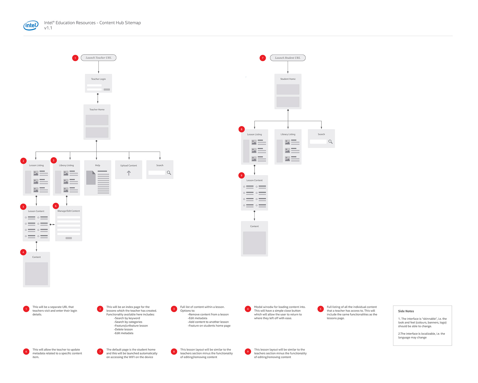
Before starting with any design work it was important to understand the architecture of the app in more detail. The original technical architecture document was written a few months previous to this so I created a more visual representation which also got the team thinking about the functionality at the same time.
Initial designs
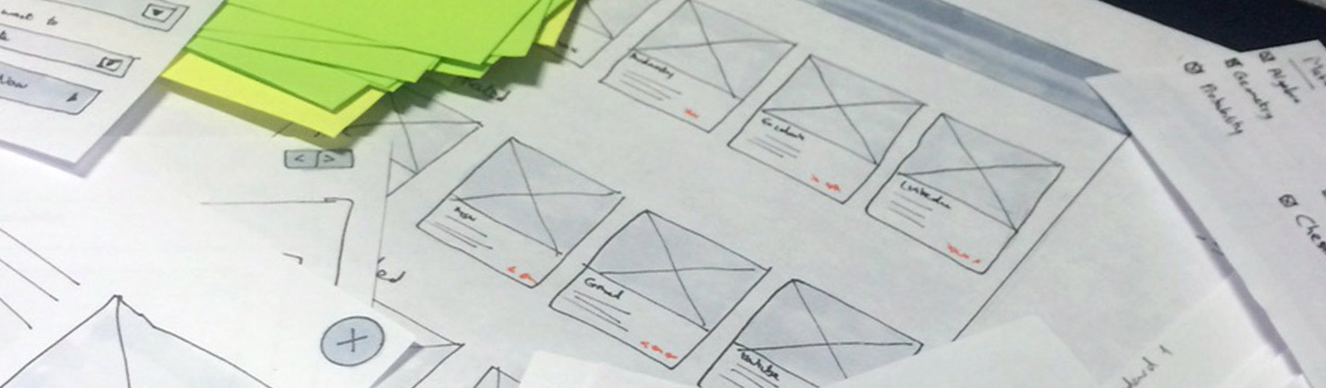
While working in-house, sketching, post-its and paper prototypes made up the early stages of the design process. This allowed me to test different layouts and explore the flow of the app in more detail. By doing so, I could easily talk to PM’s and developer to validate my ideas.
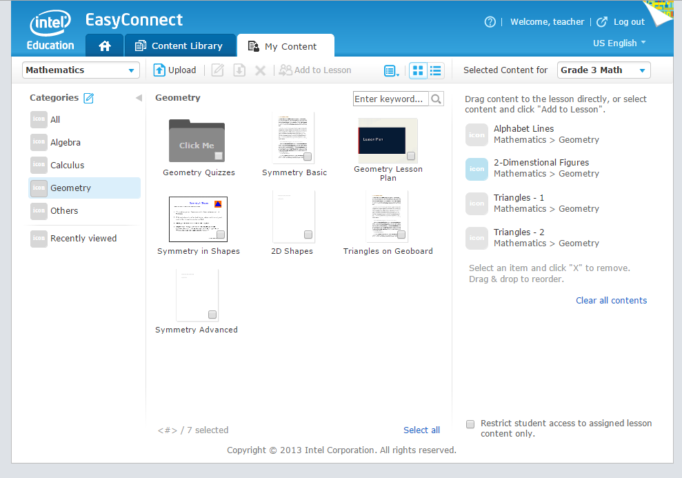
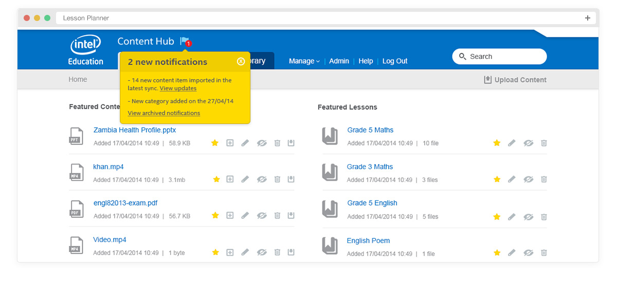
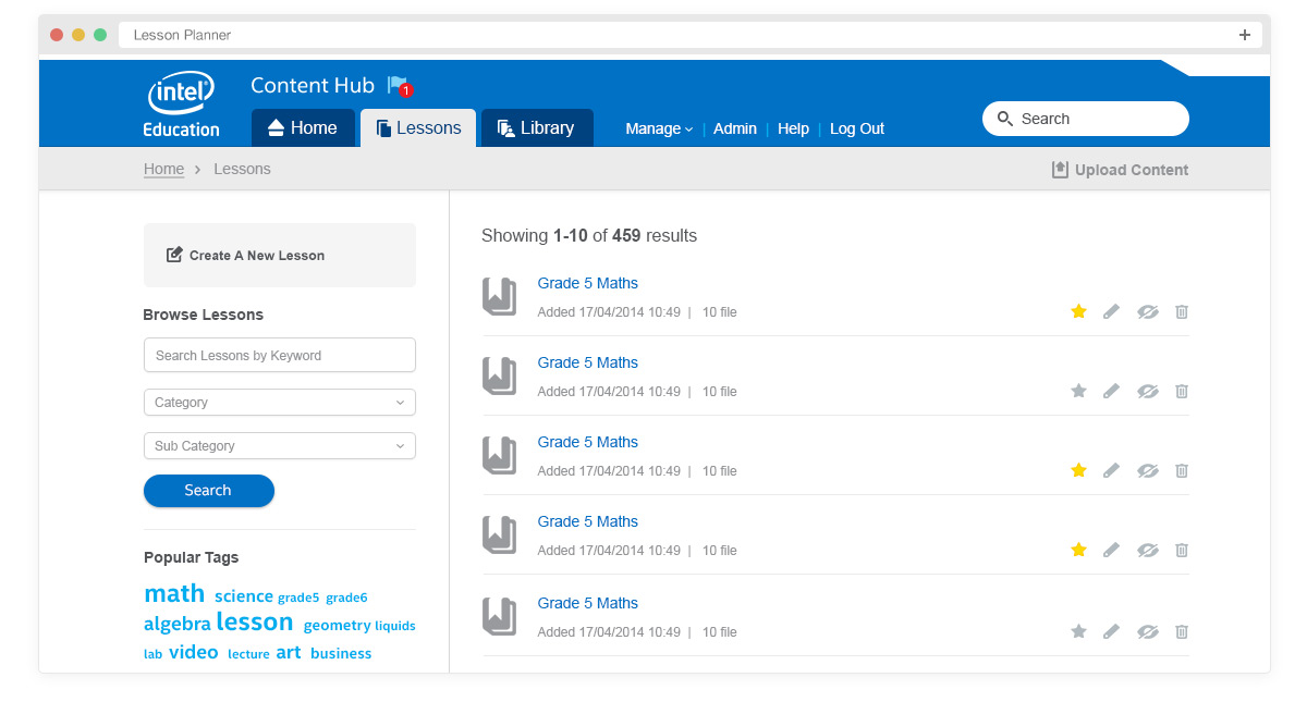
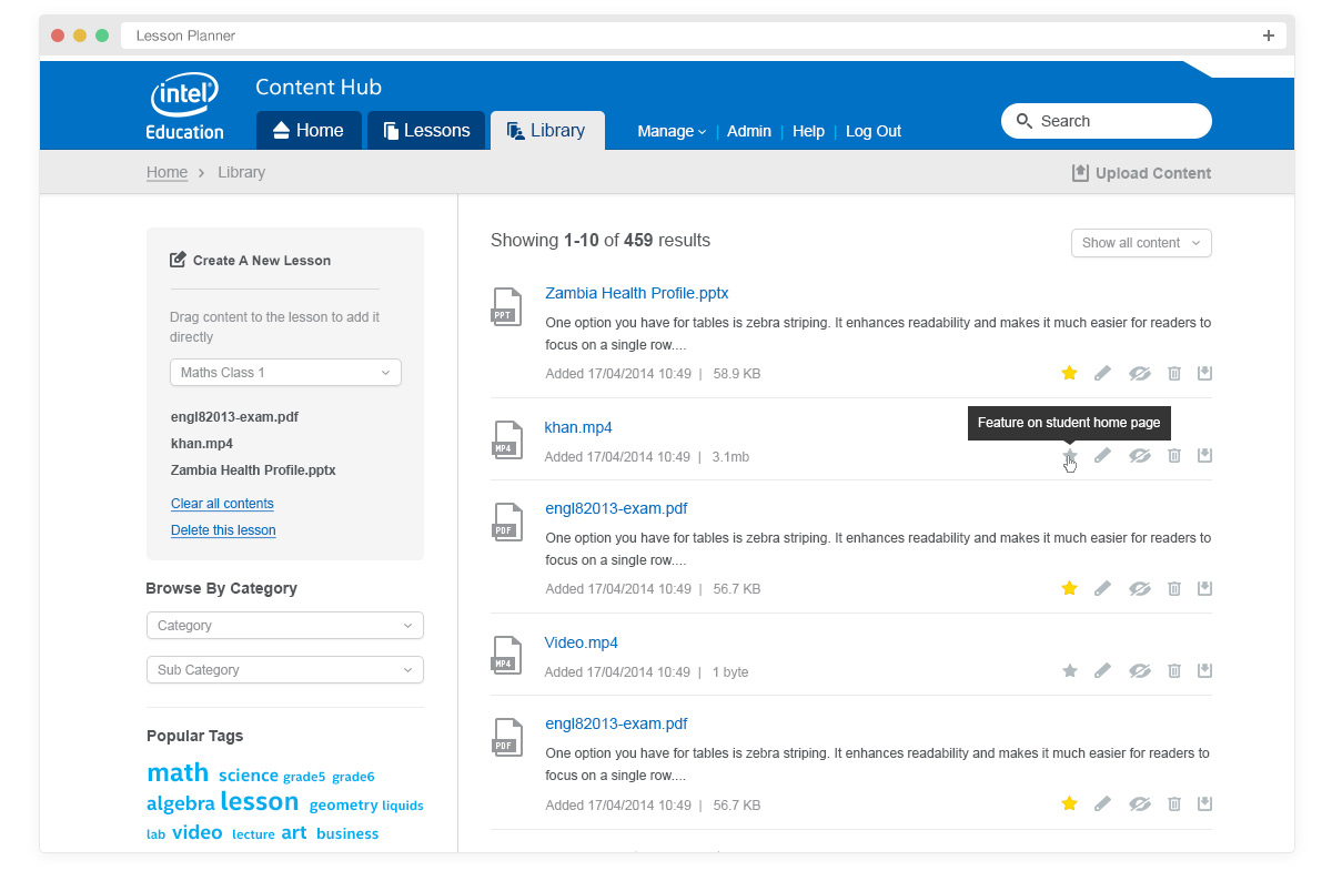
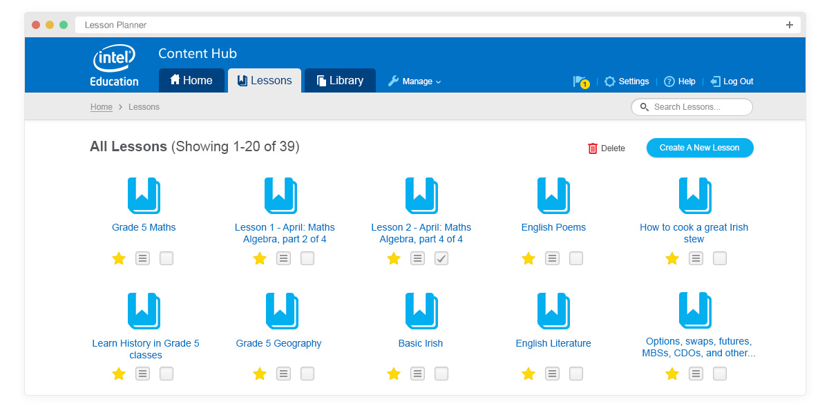
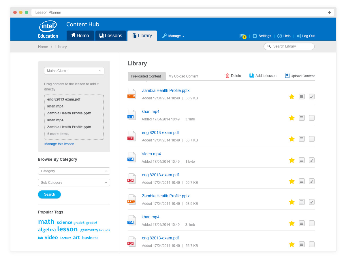
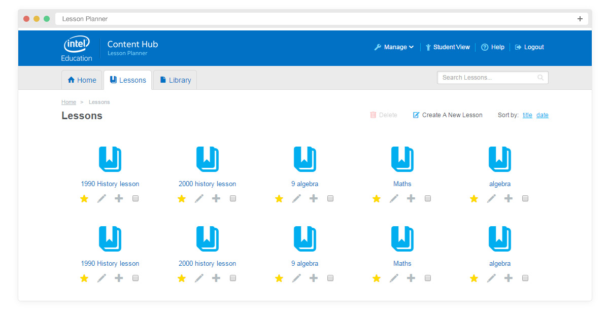
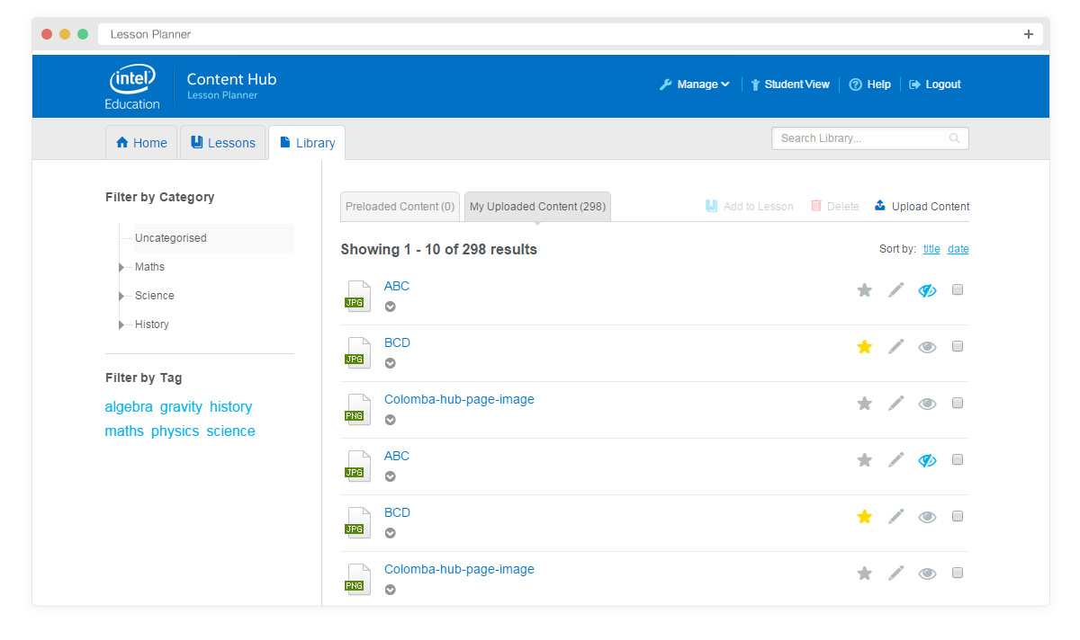
Once I finished the paper prototypes I created visual designs for the key screens of the app. Below is the home page, lessons and library listings.
Second phase
Working with other UX designers and stakeholders we decided to take a more colourful approach and redesign the layout of the home page and lesson listings. Invision app played a key role in collaboration here as we were able to gather feedback for individual pages and make decisions with ease without having to resort to countless amounts of emails.
Designing in the browser
Once we had a design signed off we began developing the framework. I worked with another developer to create this and from this point forward all design changes were made in the browser.
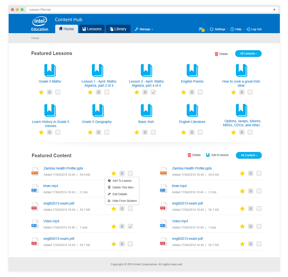
Based on feedback from the wider team and usability testing we simplified the layout of all pages to reduce the amount of icons used and improve the overall speed and use of the app.
I was heavily involved in the QA process and worked on some QA work and fixed all front-end development issues.
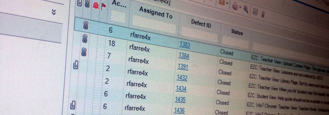
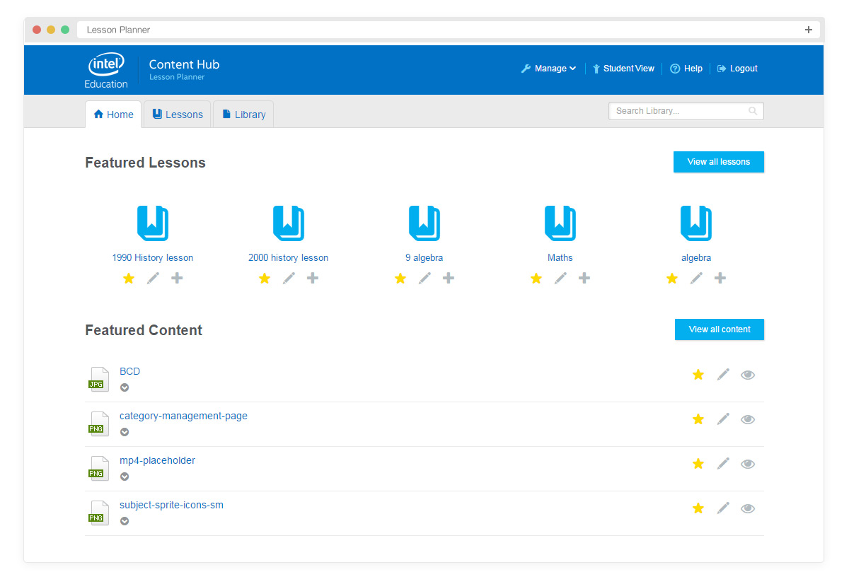
These are the screenshots from the gold release.
Reflection
This was one of my first large scale projects in a corporation and it was challenging to work on as there were no senior designers in my office to guide me. It was a big learning curve but rewarding to see the project go live for children in developing countries.
Key learning from the project
- Be open to asking for help from people around you and admitting when you don't know something. People will respect this and help out where they can
- This project was before design systems were as big as they are now and thinking about a design system upfront would have saved massive amounts of design and development time. Even thinking of styles for some basic text and colours would have been a massive help